Kronaby Web Page Redesing
Project Overview
Kronaby designs hybrid watches that blend cutting-edge technology with minimalist Swedish design.
Low direct traffic and sales hindered their growth. The PrestaShop platform created inefficiencies in design, development, and delivery processes.
💡Our solution: A complete website redesign and migration to Festina's unified, Bootstrap-based digital ecosystem. This created a cohesive brand experience and streamlined design and development workflows.
My Role & Contributions
I was responsible for the entire UX/UI process for the Kronaby website redesign.
- User research and competitive analysis to identify pain points.
- Designed wireframes and prototypes to test findigs.
- Worked closely with strategy, marketing, and development teams to ensure a smooth implementation.

Rebuilding blind
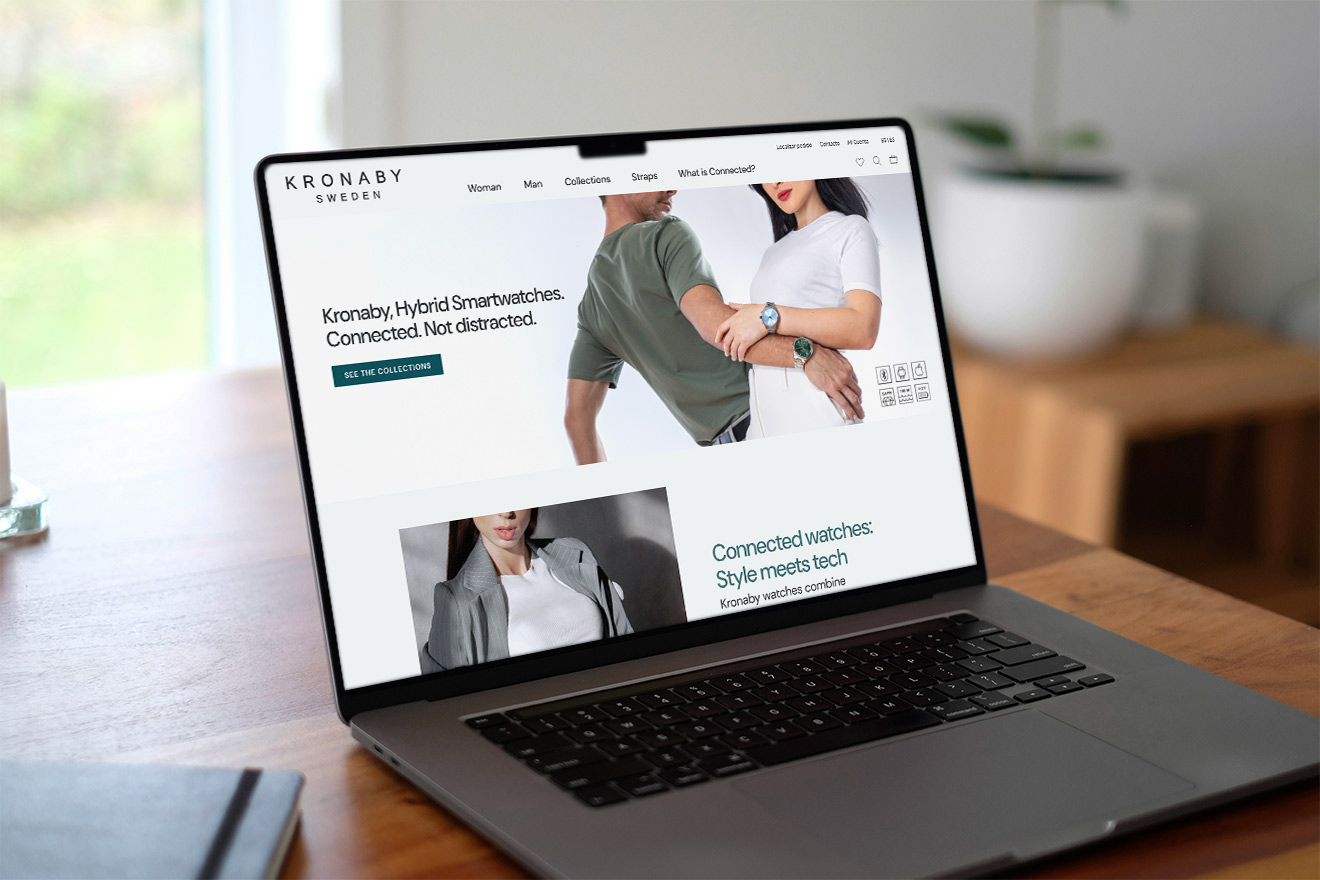
Kicking off this project, I knew the Kronaby website needed a refresh and a strategic overhaul to drive business results. It also had to fit within Festina's existing (and rigid) digital ecosystem, which meant working within certain design constraints—especially for product pages. My focus was on improving what needed it while keeping what worked.
Since the old site lacked tracking, I relied on qualitative methods to uncover key issues. I conducted user and stakeholder interviews to identify frustrations, benchmarked competitor websites to gather best practices, and reviewed the site's structure and content to spot inconsistencies.
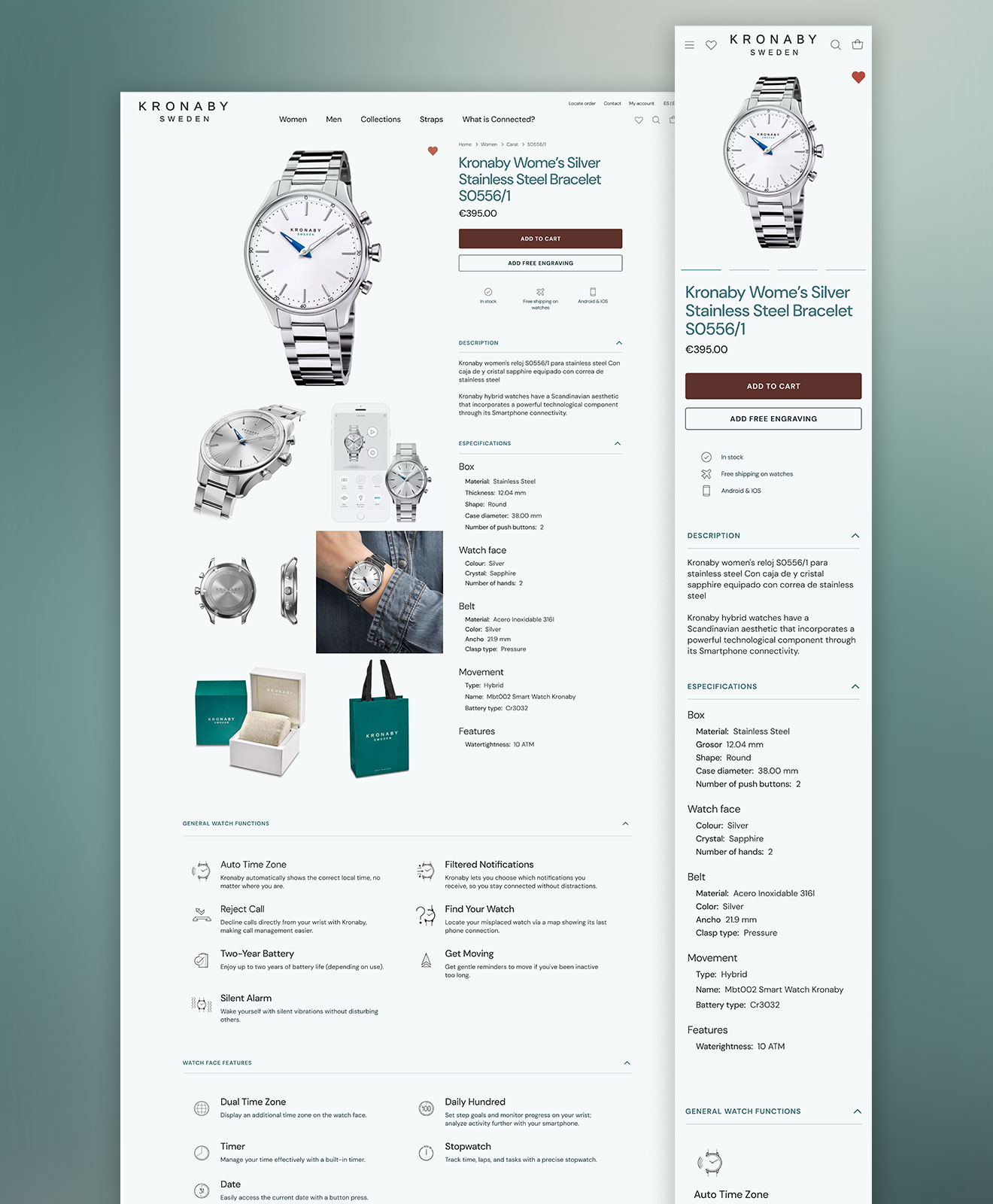
Future Considerations: A strategic vision for this project also included redesigning the including product pages and checkout. However, like a mentioned, because those parts are linked to other Festina websites, they'll be tackled in a separate, larger project. For now, we focused on improving the home and landing pages.
Understanding the Challenge
During the initial audit of Kronaby's website, I identified three core UX and business issues through quick but targeted qualitative research:
- Confusing Navigation: Users struggled to find relevant content due to an overloaded site structure.
- Unclear Product Concept: Many visitors didn't fully understand what a hybrid smartwatch was — or why it mattered.
- Weak SEO & Low Visibility: The site lacked optimization, making it harder to reach new audiences organically.
Acting Fast: From Insight to Action
Since development was about to start, I had to act fast. I conducted a quick guerrilla validation to confirm the core issue. Ideally, I would have done a more in-depth study, but the tight timeline made that impossible. Still, the rapid insights were valuable and confirmed the need for clearer explanations. To address these core challenges, I identified key insights and made data-driven UX decisions:
Insight: Confusing navigation → High drop-offs
- Findings: User testing revealed navigation challenges, primarily due to the initial webpage featuring both a top and a side menu.
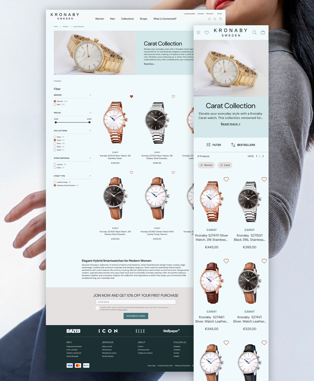
- ➡️ Decision: To resolve these issues, we simplified the site's menu and structure, refined categories, and improved the overall user flow.
Insight: Unclear product concept → Missed sales
- Findings: User feedback and stakeholder interviews showed confusion about hybrid watches's concept.
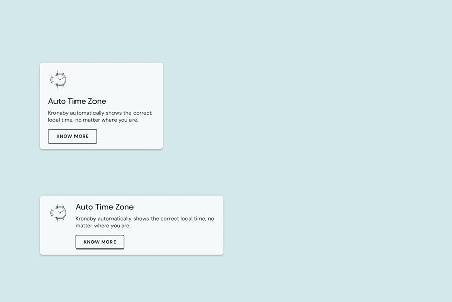
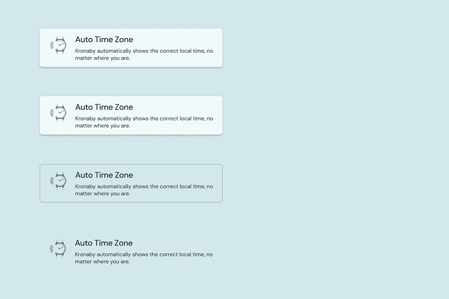
- ➡️ Decision: I added educational content with clear explanations and visuals to boost engagement and confidence.
Insight: Weak SEO → Low visibility
- Findings: Stakeholders reported low inquiries. A manual review of the site's content showed a lack of SEO best practices, potentially limiting online visibility. Competitor analysis showed stronger SEO.
- ➡️ Decision: Working closely with my team, we implemented a keyword-optimized content strategy to improve search rankings and organic reach.
Key UX decisions (Summarized)
- Navigation: Simplified site structure to significantly improve usability and user flow.
- Content: Developed and implemented educational content to clarify hybrid watch features, and standardized heading styles to enhance readability.
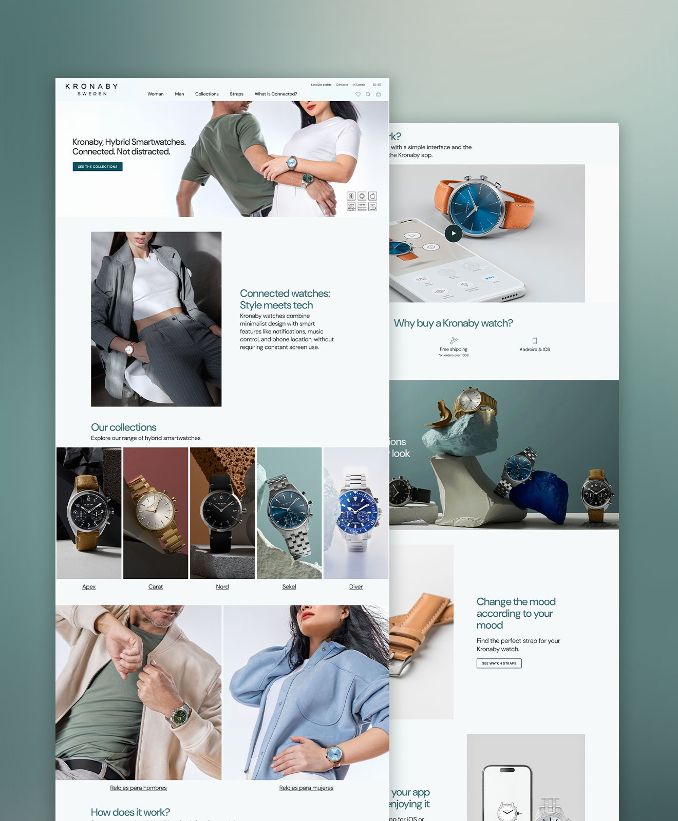
- E-commerce Optimization: Revamped home and landing pages to increase user engagement and drive conversions.
UI Decisions: Typography, colors and aesthetics
Typography: Balancing aesthetics and performance
The Kronaby app originally used Avenir Next and Minion, but this font was unavailable on Google Fonts, causing performance issues. My solution was DM Sans, a modern, minimalist typeface that aligns with Kronaby's aesthetic while ensuring better readability.
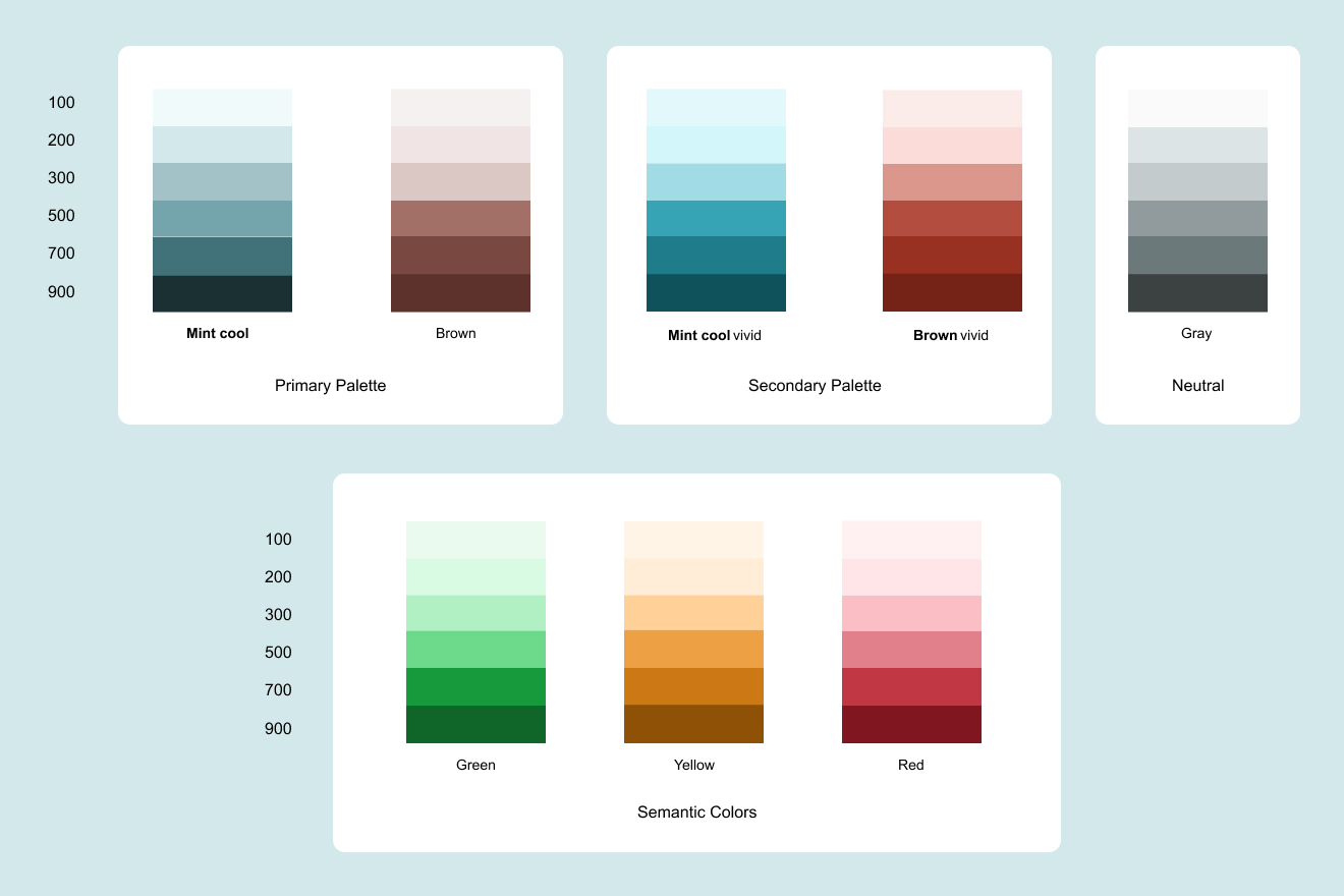
Color Palette: A modern identity
Kronaby's brand identity is rooted in elegance and innovation, which I translated into a refined color scheme:
- ✔ Primary Colors: A mint green (#417178), representing precision and technology, paired with a complementary brown (#785954) that adds warmth.
- ✔ Secondary Palette: Developed by adjusting the saturation and luminosity of the primary colors, creating depth and visual variety.
- ✔ Semantic Colors: Used strategically to enhance usability and reinforce key actions.
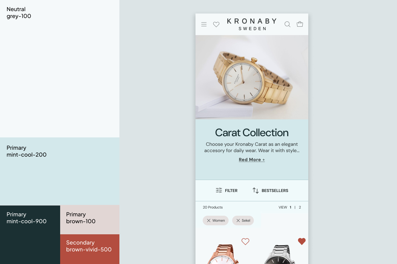
Application of colors in UI
On the product grid page, I applied the brand colors to enhance clarity and engagement:
- ✔ Background: Mint-cool-100 provides a subtle, elegant foundation.
- ✔ Typography & Icons: Mint-cool-900, ensuring strong contrast and readability.
- ✔ Interactive Elements: Brown-vivid-500 as an accent for interactive icons like the “like” button, creating a visually cohesive experience.
Bootstrap rules, building blocks, creating one component
I used all the existing components. But I noticed we needed a new piece. So, I designed a component to explain Kronaby's hybrid watch features. And the best part? It's modular, super adaptable, and, get this, totally shareable across all of Festina's brands.
Collaboration with teams
Bringing Kronaby's brand to life online required close collaboration with multiple teams across different locations:
- Spain (Marketing Team): Ensured the new website aligned with Festina Group's ecosystem.
- Sweden (Strategic Team): Maintained consistency between the website and Kronaby's mobile app experience.
Bi-weekly meetings kept us aligned and the project moving forward. I acted as a bridge between design, marketing, and strategy teams, facilitating decision-making and maintaining a user-centric approach throughout the process.
Final Results
What about metrics?
I finished this project in my last week at Festina Group, so I didn't have time to track final metrics. However, if I had stayed, I would have measured:
- 📊 Direct Traffic → How many users visited the site directly.
- 📊 Conversion Rate → How many visitors completed a purchase.
- 📊 Average Session Duration → How long users stayed on the site.
- 📊 Bounce Rate → How quickly users left the site.
Next steps for Kronaby
Honestly, the big thing would be tracking user behavior and refine the site. More engaging content, like videos and a blog, would boost SEO and explain the product. Building a community with reviews and forums would be great. And of course, tying it all in better with the rest of Festina's world, especially that checkout redesign, would make the whole experience smoother.
Key takeaways & learnings
Next project
Go to the next project