Festina and Lotus Connected D Landing Pages Design
Project Overview
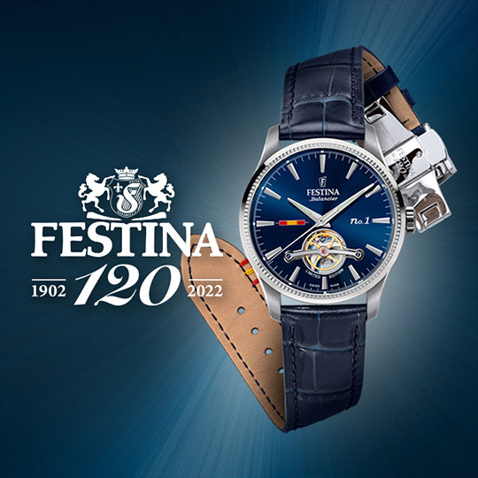
Festina and Lotus, two distinct brands under the Festina Group, each launched a new connected watch collection:
- Festina Connected D: A classic, elegant smartwatch blending tradition with technology.
- Lotus Hybrid Connected: A youthful, modern smartwatch designed for an active lifestyle.
The challenge was to design landing pages that captured each brand's unique identity while ensuring a cohesive and intuitive user experience. With tight deadlines, a unified page structure was essential for efficient development and consistency across both projects.
My Role & Contributions
I was responsible for the UI design of both landing pages, ensuring a seamless visual and interactive experience. I collaborated closely with:
- Development Team - To ensure smooth implementation using Strapi and Bootstrap.
- Marketing Team (Spain) - To align with branding and promotional strategies.
- Strategy Team (Sweden) - To define the user journey and messaging.
Together, we built landing pages that effectively showcased the unique features of each watch while maintaining a consistent design system.
1. Design strategy & execution
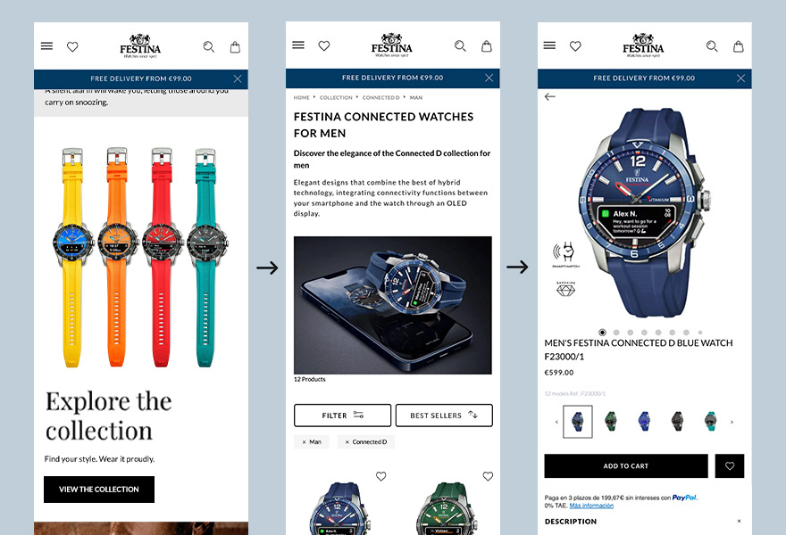
UI Concept for Festina Connected D
The Festina landing page needed to reflect the brand's core values: Quality, Tradition, and Technology. The goal was to create a timeless and sophisticated interface that balanced:
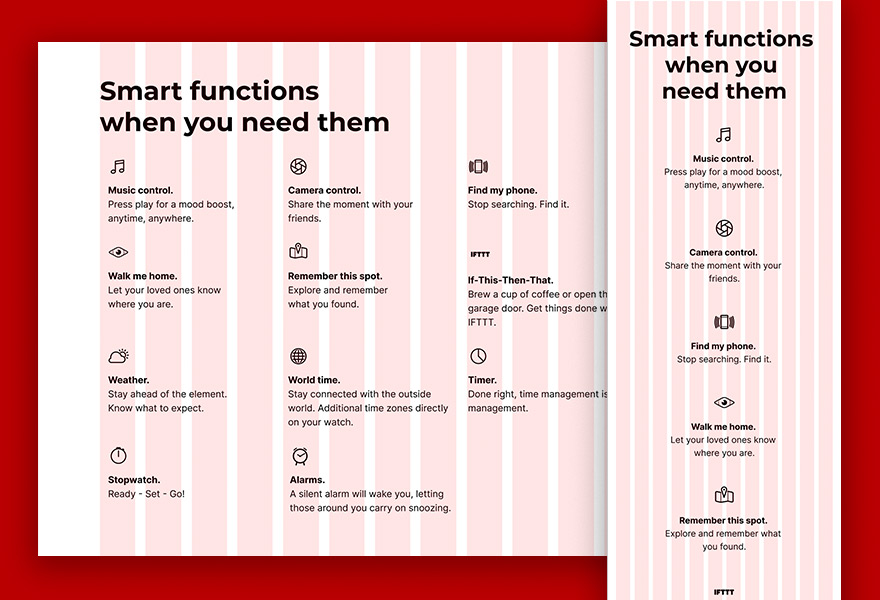
- 🎯 Smart functionality - Highlighting watch features with a clean, structured layout.
- 🎯 Elegance - Using premium typography, refined spacing, and a balanced color palette.
- 🎯 Consistency - Ensuring that the Lotus Connected D also fit within the same user journey.
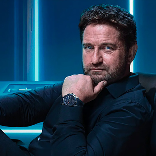
Quality
Tradition
Tech innovation
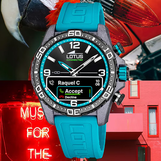
UI Concept for Lotus Hybrid Connected
For Lotus, the focus was on versatility and modernity. The design emphasized:
- ✨ Dynamic lifestyle appeal - Showcasing how the watch fits seamlessly into everyday life.
- ✨ Engaging visuals - Featuring bold, high-contrast images to highlight key features like smart notifications and activity tracking.
- ✨ Clean and modern UI - Using large, easy-to-read text and interactive elements for smooth navigation.
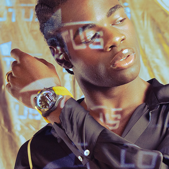
Modern and sophisticated style
Versatility for everyday use
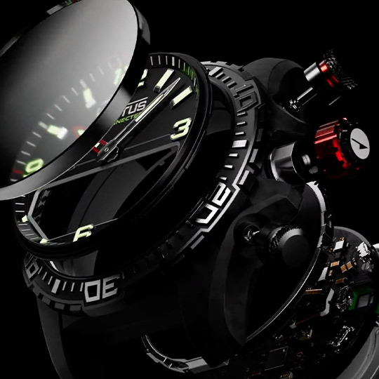
Tech innovation
2. Enhanced visuals for Web Performance
Optimizing design graphics
I received the graphic assets from the design team, and they were, generously sized. Way too big for the web. I adjusted image dimensions to align with the design specifications, preventing unnecessary bandwidth consumption.
Responsive design
Of course, it had to look good everywhere, so I optimized for both desktop and mobile. And to really boost speed, converted everything to WebP.
3. UI/UX Approach
To ensure an engaging and seamless experience, I focused on visual appeal and functionality, guided by these principles:
- Navigation & User Flow - Simple, intuitive layout guiding users through product features.
- Visual Hierarchy - Strong CTAs like "See Collection" to encourage user engagement.
- White Space & Balance - Creating a clean, distraction-free browsing experience.
- Component-Based Design - Using our existing components to streamline development.
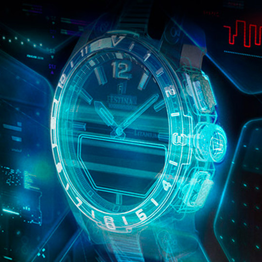
4. Just one new component
One addition was a new component designed specifically for, large, eye-catching images to grab attention and highlight key products. Figma plugins and Storybook streamlined the design-to-development process.
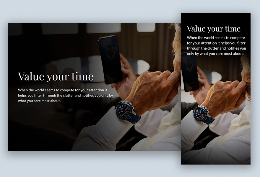
New component: fgp-ui-text-on-background
- ✔ Purpose: Text overlay component for impactful hero images and background sections.
- ✔ Application: Used to highlight key features dynamically.
- ✔ Flexibility: Customizable text position, alignment, and size for a responsive design across devices.
You might notice the component names are a bit of a head-scratcher. We're keeping them consistent for now, since everything's interconnected, but a naming overhaul is definitely on our to-do list.
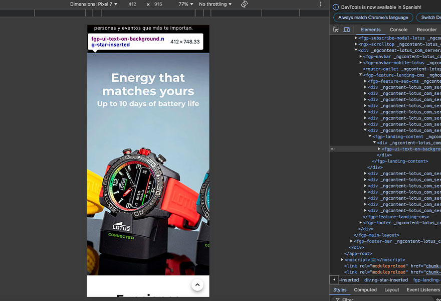
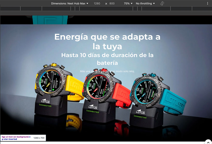
Landing Page Example: Text overlays on background images highlight the Connected Watch's features and benefits, enhancing the visual narrative.
5. Post-development QA & refinements
After development, I conducted thorough QA testing, ensuring:
- Ensuring design consistency and functionality from Figma to the live website
- Optimized image performance for both desktop and mobile.
- Smooth interactions across all devices.
6. Final results
After development, I conducted thorough QA testing, ensuring:
- 🚀 Successfully launched two visually compelling landing pages.
- 🎯 Each page captured the essence of its respective brand.
- 🤝 Collaboration between UI, development, and marketing delivered a seamless user experience.
7. Key takeaways & learnings
After development, I conducted thorough QA testing, ensuring:
- Clear Communication is Key: Collaborating effectively with developers, stakeholders, and potentially users requires clear and concise communication. This project likely emphasized the need to articulate design decisions and rationale effectively.
- SEO vs. User Experience: Compromised Design: This project brought to light the classic conflict between SEO and UX. I advocated for a more streamlined design with less text, prioritizing user engagement. However, SEO requirements ultimately dictated a text-heavy approach. While I presented a strong case for user-centered design, the final decision reflected a prioritization of search rankings, demonstrating that even well-reasoned UX arguments may not always prevail.